
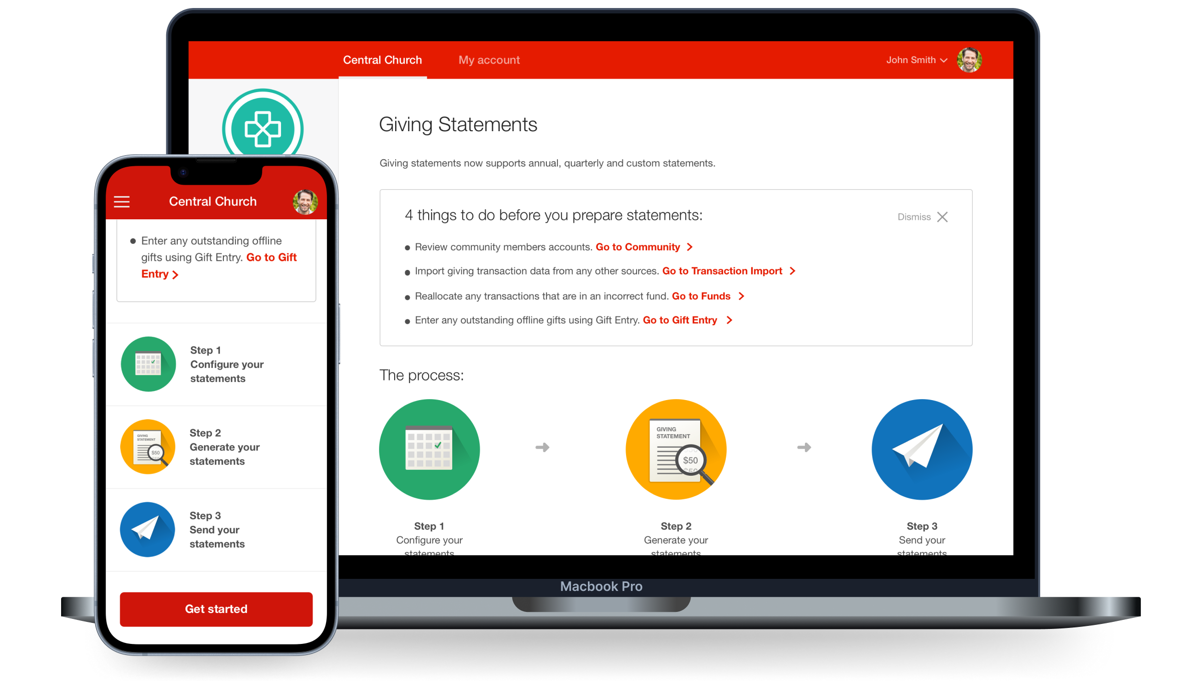
Giving Statements
My Role:
Designed the interaction model, prototyping and final UI
Outcome:
Launched October 2018
150,000+ tax statements successfully generated, reducing reliance on needing multiple tools
Background
Pushpay's Giving Statements tool originally only allowed church admins to generate tax statements once a year. This meant they were wasting time using third-party tools to generate statements more regularly, resulting in inaccurate financial information being sent out.
To reduce the maintenance of multiple products and improve communication with more accurate financial data for church givers, we updated the existing feature to support quarterly and custom tax statement generation for churches to send out more frequently and accurately.
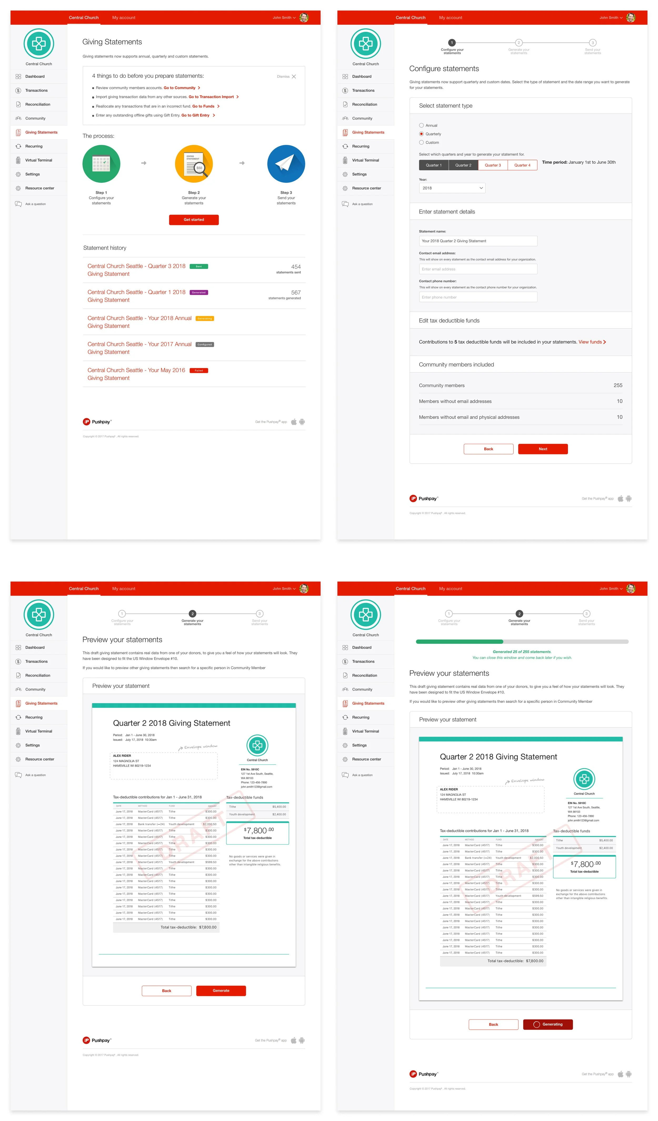

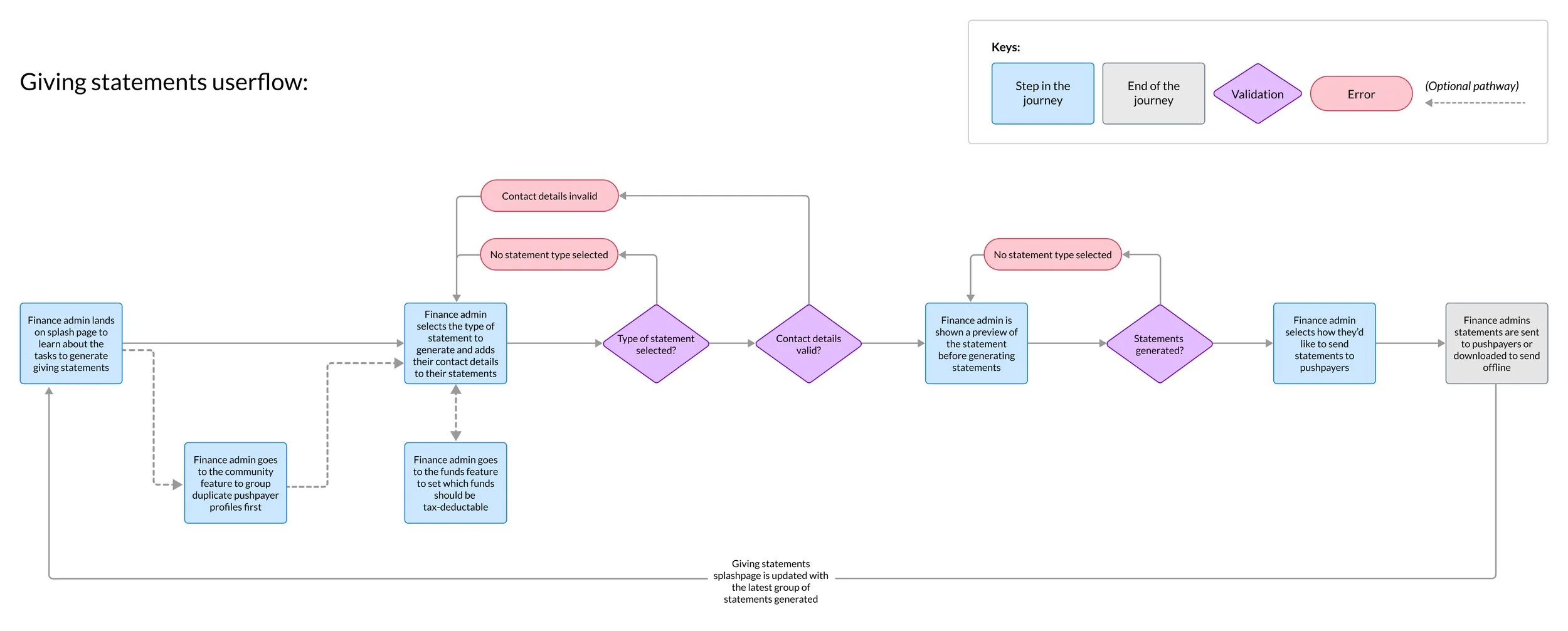
Userflow for Giving Statements
I led the direction for an improved userflow for Pushpay users. Originally the experience was 5 steps which I reduced to 3 to speed up setup time. Other significant changes to the new user-flow design I applied included:
Removed unneeded links that were pulling users out of the flow mid-task
Added a statement history view so admins could avoid re-generating statements they'd already sent
Introduced a new configuration page for admins to set their preferred send method — email, SMS or physical mail
Ideation and Prototyping
I facilitated a co-design session with my team to generate low-fidelity ideas before moving into prototyping. From here I took the strongest ideas and formed a new prototype in UX Pin for testing
From 5 rounds of testing, key trends we found included:
The majority of users wanted to preview and download statements before sending out to their givers so they could be sure what would be sent.
Users wanted to be able to customize content for their emails so they could be more personable with their messaging
Loading spinners in the prototype gave no indication how long users have to wait until all statements are generated
" It’s definitely improved… Hands down this was much better, much easier to manage and think through. I remember hesitating quite a bit with the other ” - Customer quote from user-testing
UX Pin prototype

Co-design sketches


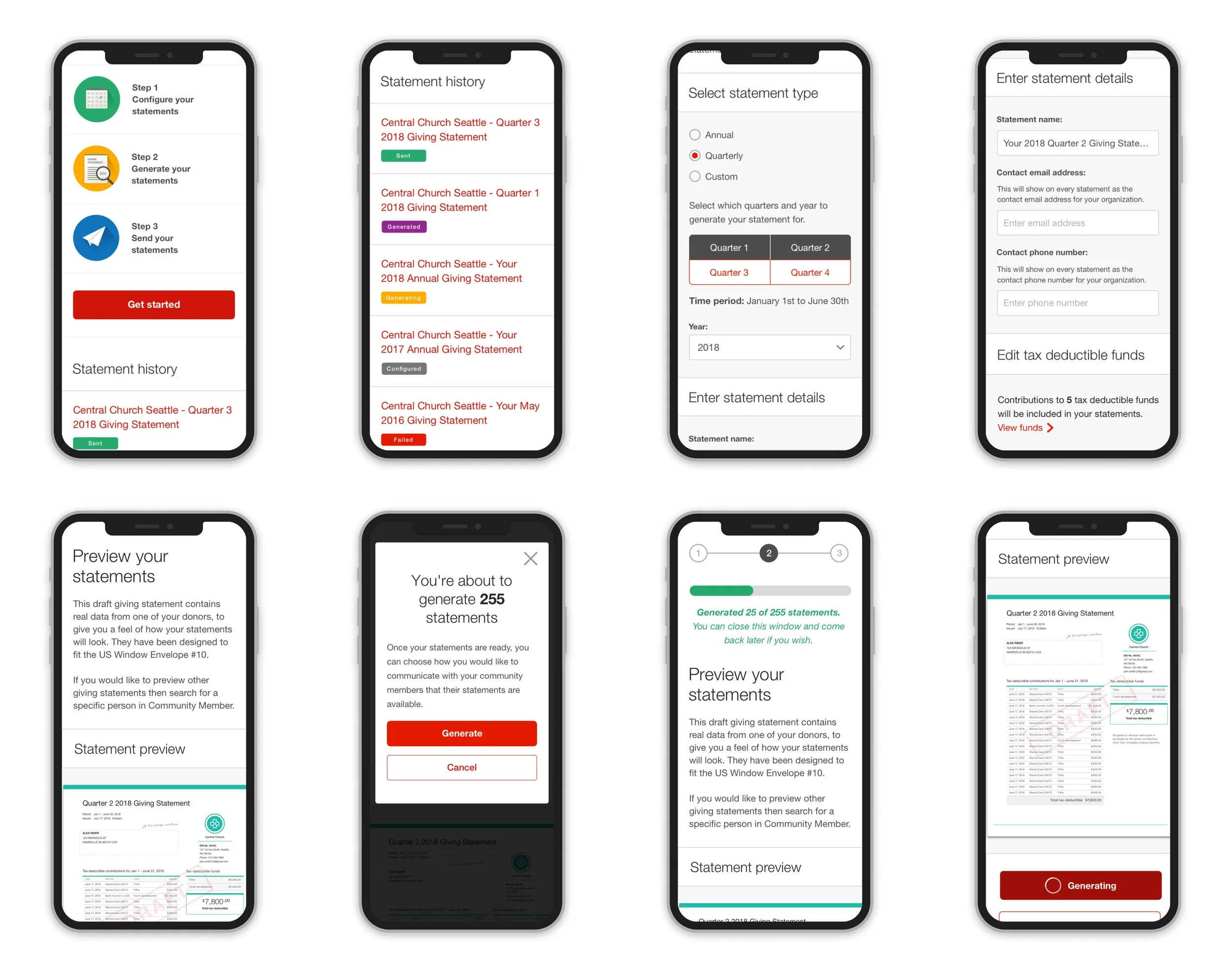
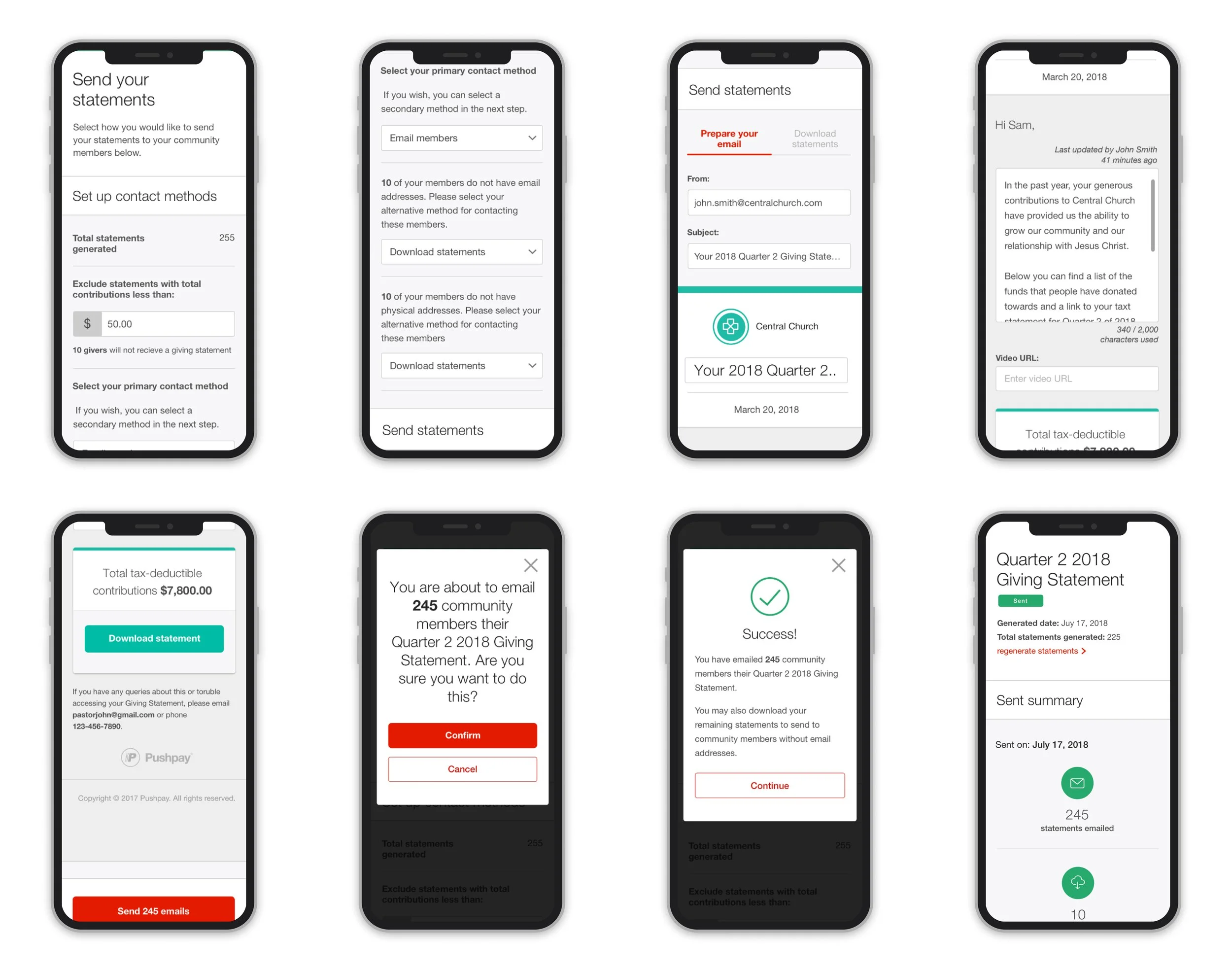
Final UI Design
I utilised our design system to create a consistent visual experience across desktop and mobile. I also collaborated with the development team to code the HTML and CSS SVG tick animation for the success state.
Mobile UI designs
Compromises we made for our timeline
The biggest challenge I faced was working with a fixed deadline. As we had told our customers in advance that we would have this feature in the market by the beginning of quarter 3, we had to cut back on certain requirements to ensure we met our deadline.
I collaborated with key stakeholders to make sure we were aligned on what we needed to cut back on to reduce scope. Compromises we made included:
Launched with email only — our most commonly used delivery method and deferred SMS and physical mail to a later release.
Cutting out timeline and auto fill improvements for the launch and adding these in as fast follows after the launch
Delivering mobile UI layout updates gradually as most of our users would do this task on desktop according to internal analytics
Outcome
The feature was successfully launched live and on time to Pushpay’s customers.
Over 150,000 tax statements have been successfully generated with multiple Pushpay users providing positive feedback on how the redesign helped save time using multiple tools and improved their outreach to church givers.