
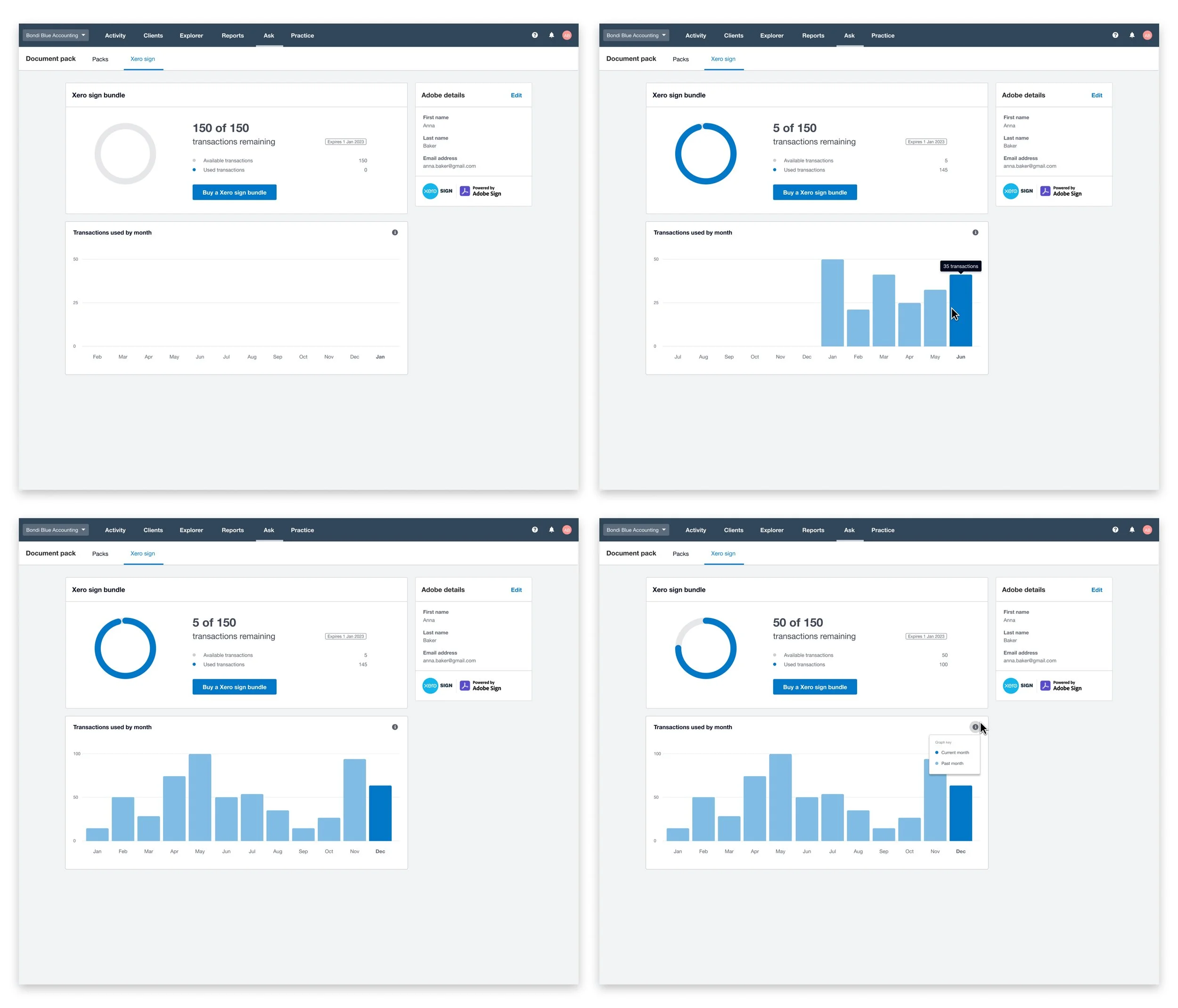
Transaction usage chart:
The Transaction usage chart is a data chart to help accountants and bookkeepers make better decisions on which signature bundle to buy for their document signing feature in Xero.
I led the design process for this feature work and had the following responsibilities:
Competitor analysis
Building prototypes
Unmoderated testing
Designing the responsive UI design
Users problem:
When practices use our online signing tool called Document Packs, they’re unable to break down how many signatures they’ve used to make better decisions on which bundle of signatures to buy to add multiple people to sign at once.
We would also continuously get customer support requests for this data so by sharing this information to users, we believed it will reduce the amount of support requests coming in for this data
Competitor analysis:
I worked with my product managers to identify various bar graph examples to help ensure our design was consistent with other data graph patterns relating to usage data.
We explored a variety of different designs from different industries including energy apps and customer feedback apps and explored their strengths and weaknesses.
Some of the key trends we applied into our design from competitor analysis include:
Past historic data should show from left to right with the current month sitting on the right
Darker colours were used for the current month and lighter colours were used for past months
The y-axis numbers should scale upwards as the data rises

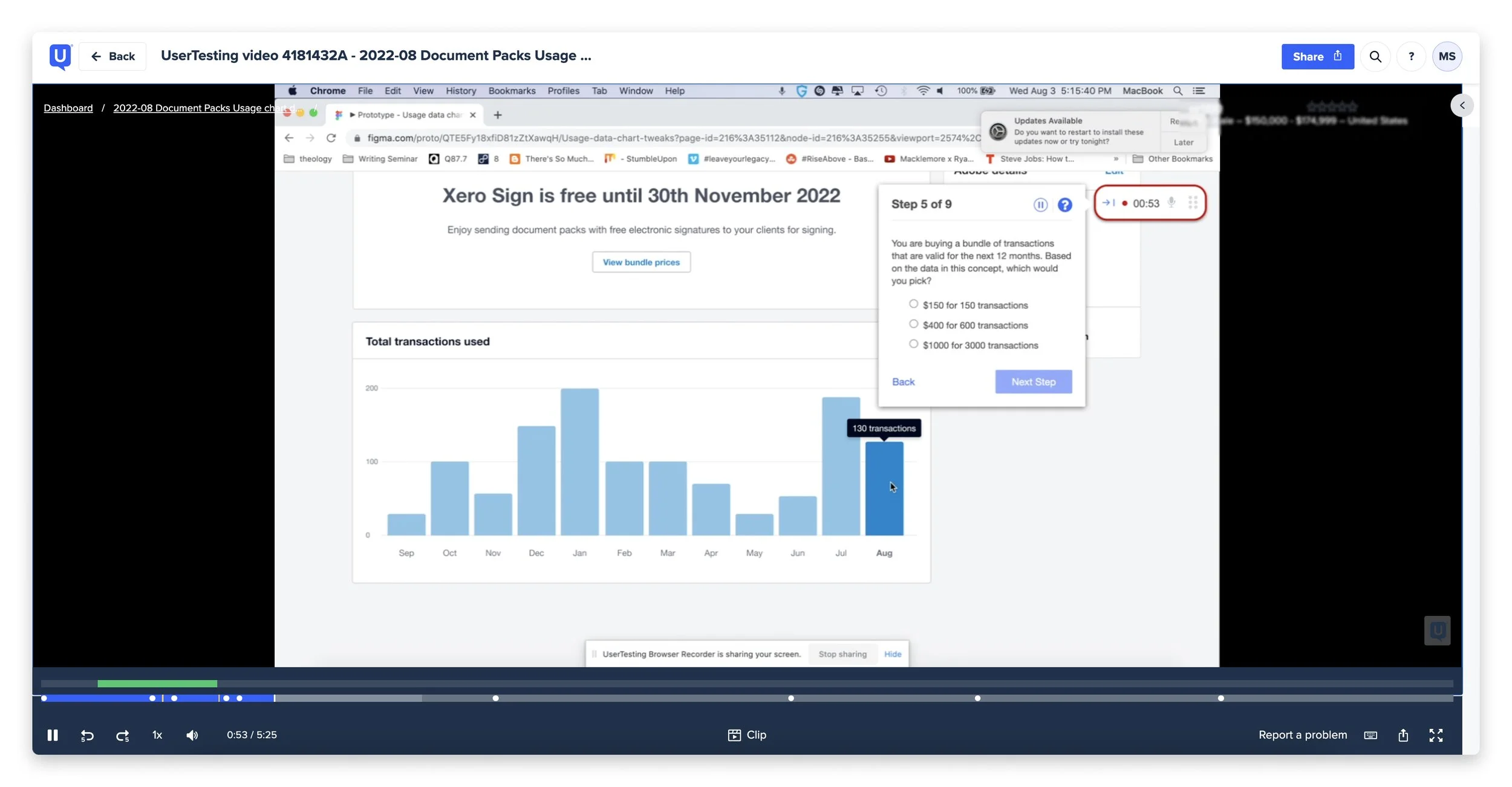
Unmoderated user-testing:
After completing competitor analysis and our inital design concept, we wanted to ensure that users could understand our design concept as our usage chart dealt with influencing how much our target audience spends for our feature and is an undoable action.
To ensure that we were validating our design concept in an efficient timeframe, we went with unmoderated testing on usertesting.com to get a wider range of feedback from accountants and bookkeepers faster than traditional moderated testing.
I worked alongside other design researchers and my product managers to ensure our unmoderated testing script was bias free as possible and that our research plan was clear and concise.
Testing results:
We managed to recruit 9 users who all understood our design and how to use the data there to make a decision on how much to spend. I also produced a one-pager summary to share with my agile team so that they were aware of our user's feedback.
““Really easy to use, love the hover feature so that I don't have to open a new tab or navigate away from the dashboard” - Customer quote from unmoderated user testing
“It was simple to use and quick to find transactions per month.” - Customer quote from unmoderated user testing
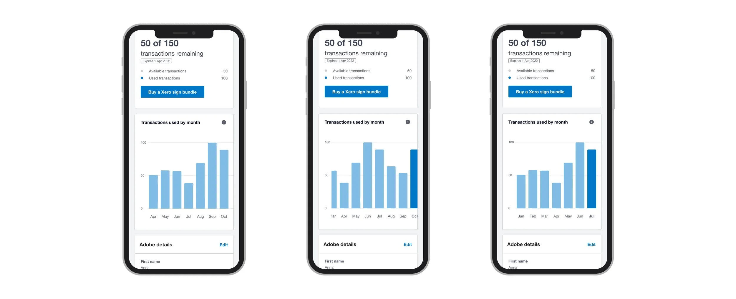
Responsive UI:
With the responsive UI design, I outlined multiple states when different amounts of data is present in the graph and built multiple designs for various screen sizes such as iPad and smaller mobile widths.
Mobile designs:
End result:
The Transaction usage chart was launched in August 2022. The usage chart has also significantly reduced the number of customer support tickets and enabled our target users to make better decisions on what signature bundles to buy for their business needs.
Our work was also well received by our former GM of product for the simplicity and purpose of our design.
“This kind of work makes me so proud of all we’re doing in this part of the practice space. Beautiful, functional and thoughtful. I love it!” - Ross Stanley former GM of product for practice